The pandemic kickstarted a movement towards more online events, or “webinars”. And, while the masks and lockdowns are largely behind us, online events are here to stay.
To promote one of your own, you need a well-crafted webinar invitation email. In this article, you’ll learn how to optimize your webinar’s email marketing, with templates and examples to inspire you.
Webinars are a powerful strategy for businesses who want to educate, engage and convert their audience. They’re an easy, cost-effective way to reach a wider audience and generate more, relevant leads to your business.
However, the success of a webinar largely comes down to the number of registrations you rack up and how well your webinar converts them.
In 2024, email remains the most effective platform for increasing registrations.
Put simply, a webinar invitation email is the best tool to let your audience know about your upcoming event. Since recipients can forward emails to other people in their circle, webinar emails can also be instrumental in brand awareness.
A well-crafted email highlights the benefits and key talking points of your webinar to increase engagement and reduce the number of no-shows.
It’s an unmissable step in your webinar marketing strategy.

So, you want to create a webinar invitation email that gets opened, encourages sign-ups and reminds people to show up to your online webinar.
While there’s no one-size-fits-all way to guarantee success, you can give your webinar the best start by following these practices.
A compelling subject line gets emails opened, so getting this right can mean the difference between a sign-up and an email that goes in the virtual trash can.
Keep your subject line clear so recipients know what’s inside.
If possible, build intrigue or include an action verb, such as “Save the Date…”
The email body copy should contain the key details about your webinar. Aim for a webinar invitation message that answers every question a subscriber might have.
This should cover:
Most people today lack the time or desire to read long-winded emails.
Keeping emails short and sweet is just one simple way to boost engagement.
To achieve this, cut out unnecessary fluff and keep the focus on the end goal: Getting more webinar sign-ups.
No webinar invitation email template is complete without a call-to-action (CTA).
Include your email CTA within a bold, colorful button that catches the eye. The copy should be clear and simple, such as “Sign Up Today” or “Reserve Your Space Now”.
You could even play with adding multiple CTAs throughout the body copy as this could boost conversions - just don’t overdo it!
Email builders are a great tool to make sure you include those all-important elements, like CTAs, in the most effective way.
They give you access to hundreds of template designs that follow best practices to maximize engagement. These templates are available to all users and are formatted with clear, strategically-placed CTAs and other key components.
All you need to do is customize the pre-made designs with your own content and colors, to quickly create professional, on-brand emails that are more likely to convert..
How can you ensure subscribers don’t forget about your webinar once the date rolls around?
Let them add the event to their calendars with an ‘Add to Calendar’ link or button in the email.
Using urgency creates FOMO (fear of missing out), which is a tactic commonly used by marketers to encourage action from their ideal customers.
Avoid creating a false sense of urgency, which can come across as spammy, but go ahead and include a timer to let recipients know how long they have left to sign up.
Studies found that just the presence of a timer lifts conversions by 8.6%.
If the sight of a blank email composer window feels overwhelming, let these webinar invitation email templates inspire you to get started.
Email builders come with a library of beautiful and professional templates, that are ready to customize with your content. A drag-and-drop editor means this process is quick and easy for everyone (even if your design skills are limited!)
You can also save and reuse any components you create, which is an incredible time-saver when creating future emails. An in-built brand kit lets you save your brand identity (such as fonts and colors), so every email is consistent, recognizable and more likely to perform well.
We’ve gathered a selection of templates. Simply customize your chosen template with your webinar’s details and copy and paste it into your favorite into your email platform.
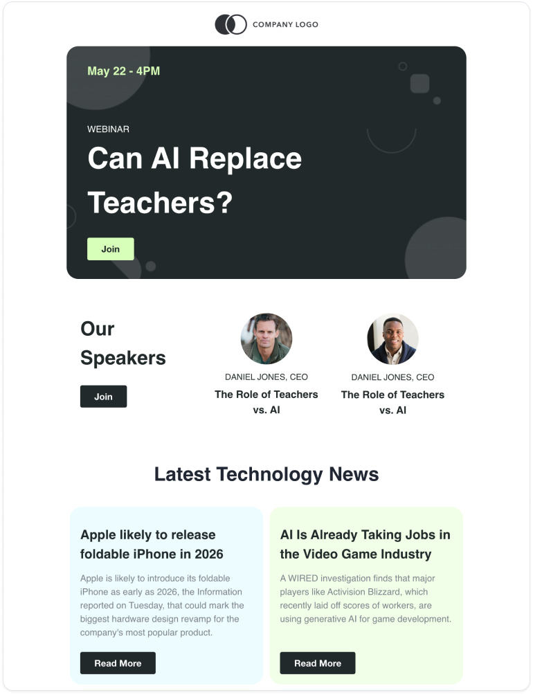
Use this simple template as an open invite to your subscribers. Customize it with all the necessary details about your online webinar.
Personalizing your emails by simply including your recipients’ names can make messages more engaging.
Stand out in busy inboxes by including a name in the subject line and the email body copy.
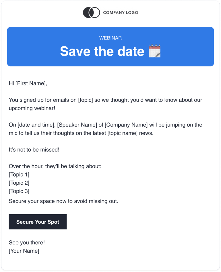
Even interested recipients can forget to register for your webinar. Life happens, so we have to give them a nudge to boost response rates and maximize the chance of a successful webinar.
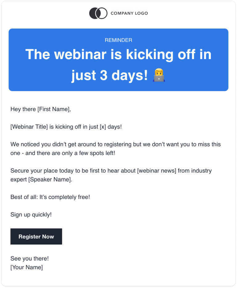
If you’re in search of more inspiration, these webinar invitation email examples are for you.
We’ve rounded up three of the best examples that merge engaging, beautiful designs with concise copy.
Shopify uses an eye-catching design with minimal copy that doubles down on the speaker’s credentials. They offer three ways for recipients to save the date, so no one has to miss out.
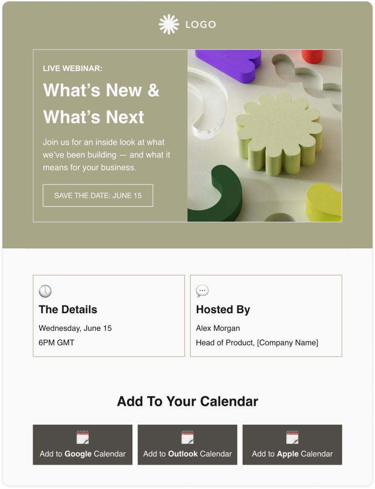
This webinar invitation email example by Circles is a follow-up email, sent to emphasize the incredible selection of speakers at an upcoming webinar.To follow this example, use reminder emails to introduce extra benefits to your subscriber base, so they won’t dream of missing your event.

Once someone signs up for your webinar, your work isn’t quite done.
Send a confirmation email containing a reminder of the webinar details. Use this to confirm they’ve made the right choice and give them another chance to add the webinar details to their calendar.
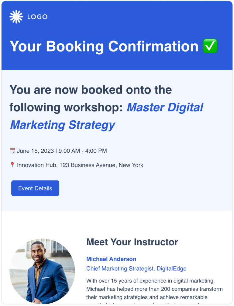
There are tools that let you access hundreds of free, professionally designed templates for all sorts of purposes - from webinar invitations to survey email templates.
These tools are known as email builders. They come loaded with HTML email templates designed to maximize engagement and ready to be customized with your own branding. Thanks to drag-and-drop functionality, you can update templates in minutes (zero design experience required!)
An email’s subject line is such an important component that it pays to spend extra time getting it right.
To help, here are some webinar invitation subject line examples to improve open rates and achieve more registrations:
An email sequence is a series of emails introducing and then reminding subscribers about a product, service or event. In this case, the subject is a webinar.
It’s a good way to build momentum, bring more benefits into the equation and keep excitement levels high for when the date arrives.
This is a simple guide to building an email sequence for webinars.
Design an engaging webinar invitation email that includes the key details and follows the best practices we laid out above.
An email builder can save you the hassle and costs of designing templates from scratch or hiring a designer.
Easily add content from your favorite sources by dynamically scraping content from the web. So, if your webinar is already advertised online, all you need to do is copy and paste the URL. The tool does the rest.
Export your design to Gmail, Outlook or any email service provider and send it to any subscribers who might be interested in the webinar.
Design and schedule follow-up emails to your subscriber base.
You can send nudges to remind those who haven’t registered, and send reminder emails to those who have.
This helps clock up those registration numbers and keeps excitement levels high, to ensure a good turn-out on the day.
After the event, send an email thanking guests for their time and sharing any relevant resources.
You could also consider sending a recording to anyone who couldn’t make it.
At this point, get a pulse check on the event’s success by sending a quick feedback survey.
Take your webinar invitation email up a notch by adding the following features, collected for their ability to boost sign-ups and bring some more flexibility to your online event.
Duplicate the same CTA button in multiple places in your email. The copy and button design can stay the same - just add one button at the beginning and one at the end of your email.
If people can’t make your live webinar, give them a chance to register to receive the recording after the event. Top tip: You may want to offer this after the event, and include it in the post-webinar email to encourage people to attend the live event.
Send a brief video to highlight the benefits of the webinar. It’s best if this comes from the speaker, who can introduce themselves and outline the topics of discussion.
Webinar invitation email templates in email builders have been designed by email marketers, coders and designers and follow all best practices to maximize engagement.
They contain those all-important fields, including placeholders for a webinar title, date and time, logo, photos, CTA buttons and agenda.

Don’t fall into any of these common pitfalls when sending webinar invitation emails.
Avoid bunching up a webinar invite into your regular email newsletter. Instead, send a dedicated email that’s solely focused on your upcoming webinar.
Segment recipients to ensure you only invite people who’d potentially be interested in your webinar.
Your email should convey the webinar’s value. Keep copy clear and concise, and don’t overwhelm with detail.
It’s easy for your initial email to fall through the cracks. Send follow-up emails or you risk missing out on potential registrations.
Follow the tips in this blog to compose a webinar invitation email that has real impact and sets the scene for a busy, successful webinar.
Get it right the easy way by using pre-designed templates from an email builder that’s packed with the features that make email design a breeze. You’ll find templates that include everything your email needs and can be customized with your content in minutes.