Ultimate Employee Newsletter Layout: Expert Tips & Examples
Try Publicate For Free Today
Start Now
“It’s what’s on the inside that counts.” Sure, this can be said about people, but it’s also true of email newsletters. Once someone reads a subject line in their inbox (or mobile push notification) and chooses to open the email, the newsletter layout can make all the difference between whether they remain engaged or quickly apply their attention elsewhere.
That’s why we are here to share how to create a newsletter that captures the eyeballs and minds of its readers.
Whether you’re sending internal communications to your own employees or an external newsletter to customers, newsletter tools can be of great service to boost your email campaign’s success.
Keep reading.

Employee email newsletters share important information within your organization. They are a complement to internal communications tools and can serve a myriad of purposes.
Perhaps you want to share an update from the C-Suite, you can do that with an employee email newsletter. Or, you may wish to introduce a new employee to the rest of the organization, there are email newsletter templates that fulfill this purpose.
Whatever you wish to convey to your audience, an email newsletter can be a useful form of communication, especially because you can track and monitor its success with important key performance indicators (KPIs) such as open rates and click-through rates, to name a few.
Whether you understood the value of an email letter before reading the above or not, you’re probably now wondering what it takes to create an engaging newsletter rather than one that falls flat.
Let’s take a look at some of these best practices that will help you to design and send a newsletter layout that works.
There are a few different newsletter layout types to choose from when designing your email. These include:
When using an email builder like Publicate, all email newsletter templates are designed to work on any screen size and across whatever email provider you wish to use to send your newsletter on. So you can be confident every email will look great and without any coding needed.
Your header is the first line of copy that your audience will see and read at the top of your email newsletter. Depending on what message you’re trying to get across, your header will vary in its tone.
For example, if you’re promoting an event, you can be fun and conversational with a witty headline. If you’re sharing a new company update, you may want to use a more serious tone, but still find a way to grab attention (perhaps by directly addressing the reader).
Below the headline sits what’s known as the body copy, or in other words, the meat of the email newsletter. Since your header is short and to the point, your body copy is used to dive into the details.
All the important information exists here. But, keep in mind, that you still want to distill the message to the most important points because no one wants to read through blocks of text to try to figure out the main message.
It may be the case that you’ll need to direct your readers to an external source with more information that doesn’t appear in the email newsletter itself.
This could be the case if you are hosting a webinar and need your team to RSVP or sign up in a third-party software. For these purposes, insert a link. Make sure you make it clear to your readers that it’s a clickable link; the standard practice is for a link to be blue and underlined (or possibly in a button).
Using a tool like Publicate’s email builder, inserting a link is as easy as clicking the “link icon” and pasting your URL there.
When building out your newsletter, do so in a hierarchy that makes logical sense. The most important information should take up the most amount of space and be up top.
Use different typography and/or font sizes to draw your readers’ eyes to the focal point. Another way to prioritize your different blocks of content is to use color to differentiate sections.
One of the major benefits of using an email builder is that you can create your email newsletter using a newsletter template. These templates are pre-built, so they take into consideration design best practices. This means all you have to do is drop in your copy, links, images, videos, and/or GIFs to design a newsletter in no time.
White space, or negative space is all the space that’s between elements. Just because nothing exists in those spaces doesn’t mean that it can’t serve a useful purpose.
In fact, the use of white space is a design strategy in itself because it helps to direct eyes and provide mental breaks. White space can be used to direct attention to the call-to-action (CTA) or enhance visual hierarchy.
When you’re traveling down a straight road, but there’s an upcoming turn, a directional cue like an arrow will inform you so you take action and turn your wheel.
Similarly, you can incorporate directional elements in a newsletter to direct your readers towards where you want them to look or an action you want them to take. Take readers on a journey, whether visual or story-based or both.
Any action you want a user to take should be clear. This can be accomplished with a standout call-to-action (CTA). So, how can you accomplish this? For starters, make sure that your CTA button is highly contrasted with the background so that it pops out.
Another aspect to consider is the size. If you squint your eyes, can you still clearly see the CTA? Make sure it’s large enough, clickable, and contrasted.
Also, make note of how many call-to-actions you input into your newsletter template. You won’t want too many because that can create confusion for the audience as to what next step to take. Try to limit your newsletter to just one (or perhaps two, but consider a CTA hierarchy so that the highest priority CTA takes precedence).
Make sure that your readers can easily know who sent the email without having to even look at the sender’s name. This can be done with strong branding. Incorporate your company’s logo at the top, your color palette, and your typography.
With a tool like Publicate, you can upload branding elements to the brand kit so that all your email newsletter templates will incorporate these valuable features automatically, without the need to duplicate this work every time you create a newsletter.
When including images in your email newsletter, keep visuals consistent with the copy. This means choosing visuals that evoke the same type of sentiments.
Also, be sure to include alt text that describes your image. This way, if the images don’t load properly, people can read the plain text, and it also adds accessibility for all.
These days, most people are reading emails on their phones, which are clearly smaller than computer screens. To ensure that emails render properly across device sizes, opt for responsive email design.
Using an email builder like Publicate, newsletters are automatically built for all screen sizes and platforms so you can feel confident your email will always look great.

Create newsletters faster, together.
Design with 300+ professional templates, drag-and-drop media, and unlimited teammates. Build once, reuse blocks, and ship beautiful emails in minutes.
Let’s take a look at some of the best newsletter layouts that incorporate these best practices.
1. Employee Wellness Workshop
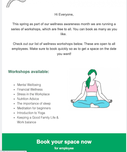
While this newsletter conveys a lot of information about the workshop, it doesn’t overwhelm the reader because of the use of white space. Plus, the call to action section is highly contrasted and exists in its own colored background area.
2. HR Newsletter - Company Perks
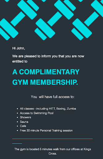
This newsletter uses a dark background that contrasts bright colors to share the message loud and clear. Again, you can see the use of a highly contrasted and single CTA that grabs attention.
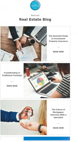
This newsletter template can be used to share a lot of different blog articles to drive traffic to the company’s blog. The Z pattern helps lead the reader's eyes to scan the page in a pattern that comes naturally. The combination of images and headline text balances the newsletter.
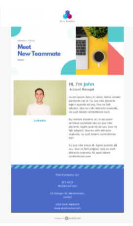
Check out this new hire email template that balances the page with colors, images, headlines, and white space. The use of white space is strategic in helping direct attention to the new team member’s biography. Although there are a lot of colors and a fair amount of copy, the newsletter template isn’t overwhelming.
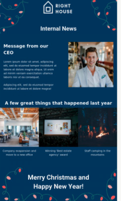
For corporate email newsletters, consider this template that contains several different updates, but breaks them down based on level of importance.
As you can see, the primary copy is the letter from the CEO (which is balanced with an image so it’s clear exactly who the message is from from the get-go). Then, you can use images to share other secondary messages.
When implementing your email newsletter design layouts, keep in mind these recommendations:
Take advantage of a tool like Publicate’s web-based email builder that provides access to an array of newsletter templates to choose from that are already built with best practices in mind.
Rather than having to spend a ton of time considering the best newsletter layout to use for your message, you can leverage pre-built newsletter templates. This way, you can share the message of your choice with your entire organization or a select few.
Ready to try a tool like Publicate out for yourself? With these tools, you can pick from a long list of email newsletter templates, modify using drag-and-drop functionality, and export to send via whatever email provider you’re already using. Try it out free today!
Turn opens into action.
Track performance in Gmail, Outlook, and anywhere your emails are read. Get clear insights, actionable recommendations, and downloadable reports to grow engagement with confidence.
Beautiful Designs
Powerful Analytics
Export Emails Anywhere
Built for Teamwork