Inspiration is everywhere. When it comes to HTML email inspiration, you just have to know where to look, right?
Well, we’re glad you’re here because we’re going to share where to find email templates and how to design them so that they have impact.
When it comes to using professional email templates, there are two main ingredients that matter– copy and design. Then, of course, you need to know how and when to distribute emails so that they are read by your intended audience.
Ready to create great emails? Let's dive into email inspiration for internal and external newsletters, plus the tools you need to get started.
Keep reading.
When you’re dealing with internal communications, the same type of emails sent on repeat can become boring and tedious. So, you’ll want to switch up your templates and design to keep it fresh. You have a lot of responsibilities on your plate, so this exercise shouldn’t be dragged out or time-consuming.
Luckily, there are many different sources for HTML email inspiration that you can pull from.
Here’s a look at four of them:
Make your way to Publicate’s newsletter templates section. Here, you’ll find hundreds of options for your Outlook email template design, or any other mail provider you may use (such as Gmail, Yahoo! Mail, Mailchimp, Mac Mail, etc.) Of course, all of these templates already incorporate design best practices.
However, without the use of the right tools, you could get bogged down for days and even weeks to develop a newsletter that is aligned with your brand’s standards. Instead, you can rely on an employee newsletter template that already has the content blocks you’d need. All you have to do is drop in the specific message you wish to send.
Publicate’s web-based email builder is perfect for internal communications because it makes it possible to create beautiful emails without any design experience. Your internal newsletters can serve to increase employee engagement.
With Publicate, you can narrow down your inspiration by type and category to find the template that best suits your purpose and message. Beyond just using the template as design inspiration, you can use Publicate to build your email in minutes using the drag-and-drop functionality.
Then, you can export your newsletters from Publicate. Once you’ve exported, you have the option to share the newsletter via your existing email service provider, communications platform, such as Slack or Teams, or via social media, such as Twitter. Publicate’s integrations make exporting your fully-created HTML email as easy as clicking a single button.
Once you send out your email, you can also utilize Publicate’s analytics to track the success of your newsletters. In essence, you have everything you need from start to finish to make the most out of the professional email templates that you like best.

Mailchimp is an email platform that also has templates ready to use for inspiration or building. To take a peek at their templates, you’ll need to sign up.
While Mailchimp is powerful in its own right, its primary function is to serve as an automation platform and to send emails. Unlike other newsletter tools like Publicate, you can’t export your emails to your own email provider that you’re already using.
You have to send from Mailchimp’s server (which can increase the risk of ending up in the SPAM or promotions tab of your recipient’s inbox).
Pinterest is like a mecca for design inspiration of all sorts. When it comes to email design, you can take a look at what’s on the board by typing in keywords. Once you’re ready to create your emails based on what you see, you’ll need an email builder (like Publicate) or a graphic designer/coder ready to get to work to make your vision a reality.
If you’re stuck in traffic, are you going to notice the Toyota or the Ferrari on the road? Chances are, the Ferrari will stick out because of its unique design. You want to create the Ferrari of emails every time because your audience’s attention is being commanded in every direction across their devices.
Like when driving, you scan the road ahead of you rather than focus on every single detail (because who has the time for that?) The same goes for reading emails.
Eyes tend to scan what’s in front of them for keywords and main points. Design can help lead readers’ eyes with different typography, color, graphic elements, and call-to-action buttons.
Email templates are purposefully designed with these best practices in mind so that you can create the most effective emails without having to labor over them for days. In the case of email newsletters, effectiveness can be measured by engagement and the ability of your audience to understand your message.
For example, say you want to send out an email to your staff about a big announcement, such as a company event. You can find a template, adapt it, and be sure that everyone will receive the email. To make sure this is actually the case, you can rely on email analytics to show you how many people got the message, how many people read it, and even, how many people clicked on any links inside the email.
A tool like Publicate makes it simple to curate content from across the web, integrate media (like videos, photos, etc). You can do all of this without the need for a graphic designer or coder. Publicate ensures that your email will render properly across any device size and any email server.
Email design has come a long way since its beginnings. Depending on what kind of message you want to send, you can figure out which type of email newsletter design is sufficient.
The three main types are:
When it comes to transforming your HTML email inspiration into practical application, you’ll want to cover all the important bases.
The key features of email newsletter design that really pack a punch include:
From content creation to design to development, there are a few best practices to keep in your mind when you’re carrying out the process of sending HTML emails.
Here is a recap of what they include so that you can create emails that could serve as HTML email inspiration for others:
If you choose to build and export your email using an email tool like Publicate, then you’ll be able to check off all the boxes for best practices by choosing a ready-made email template.
Rather than having to spend time correcting alignment issues across email platforms or coding special elements into your email, you can do everything you need to with the visual builder. This way, you won’t have to waste time and become frustrated trying to make your email work the way you envision it.
As important as your email design is, it’s of utmost importance to make your email accessible to all audiences. Accessibility starts with the basic notion of ensuring that people can understand and receive your message. Then, it moves on up to factoring in that some people may have disabilities or use assistive devices in order to read a message.
You’ll want to take all of these aspects into consideration when designing an email that works for all with the below suggestions.
When it comes to creating email newsletters, you have options for how you choose to go about the process. Do you want to start with a template that’s already laid out, or do you want to customize your content even further with the choice of content blocks?
No matter which way you choose to go, using a tool like Publicate gives you the resources you need to design purposeful and impactful emails.
1. Ready Made HTML Email Templates
Read-made HTML email templates mean that the structure is already in place. All you have to do is select your template, adjust the text, drop in any visual elements, and export the email to your email provider.
2. HTML Email Builders
Or, you can infuse an extra level of creativity by starting using an HTML email builder. Rather than starting with a template in place, you can structure your own email by choosing blocks of content and then arranging them how you see fit.
Ready to leverage good email templates for your own use? HTML email inspiration exists right here.
We’ve already shared some best practices, so let’s see what it looks like in action. Take these templates from Publicate:


.png)
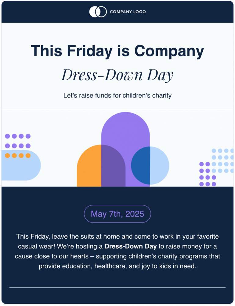
This is a great design for many reasons. For starters, it’s technically text-heavy, but it doesn’t feel overwhelming because of the strategic use of large and smaller fonts. The main headline and message are easy-to-read and accessible. Once you hit the top-line message, you go into the details of what the reader needs to know.
Although there are no images or videos, there are graphical elements and illustrations that bring life to the HTML email. Depending on your brand identity, you’d be able to incorporate a look and feel that resonates with your brand.
It’s simple, pretty, and straight to the point. Plus, it’s inherently responsive across screen sizes and can be sent using your existing email provider.
By now, you should have an idea of where to find and how to use HTML email inspiration to your advantage. Regardless of the message you’re trying to send, professional email templates already exist and are ready to use.
By using a platform like Publicate, you can easily create, design, edit, and manage your email newsletters without the need for graphic designers or coders. You’ll fulfill all the email design best practices simply by choosing an email template and getting going.