As a content marketer, you save great content you find every day. Content to share with your audience, content to read and learn from, etc. Now, you can save content to create new content with Publicate.
Using Publicate, you can turn curated content into new content marketing assets in just a few minutes. Just add content to Publicate inside the app, via an integration, or the Publicate browser extension. Then, you simply drag-and-drop content into pre-built templates to create new content assets.
In this post, I’ll share how you can create curated Publications like roundup blog posts, email newsletters, and resource hubs in just a few minutes. Follow along, and you’ll be a Publicate pro in no time.
But first, you may be asking…
I’m glad you asked!
Quite simply, a curated Publication is a collection of content (like blog posts, videos, articles, slide decks, white papers etc) that is brought together to create a new content asset that is even more valuable.
As Aristotle once wisely said, “The whole is greater than the sum of it’s parts.” (We like to think he would like Publicate.)
Content marketers often create curated content to save time in producing new content, and leverage the knowledge and insight of others to produce a “greater whole.”
I’m going to share how to create curated Publications using Publicate in a fraction of the time, and provide even more value than creating curated content on your own.
So, let’s get started…
Select a Template or Create Your Own

You have the option to choose between 4 preset templates.
Or you can choose to go for a custom template, which starts blank and you can add your own layout as you go.
You can change your layout at any time, so just selecting any of the layout options is fine to start. Personally, I usually go straight for the newsletter template.
Being able to get creative with the Publication layout means you can ensure that you are getting across the right information in the right way.
To start adding content to your template or Publication all you need to do is start dragging content over from the left and dropping it into the content placeholder that you want to add the content too, it's really that simple.
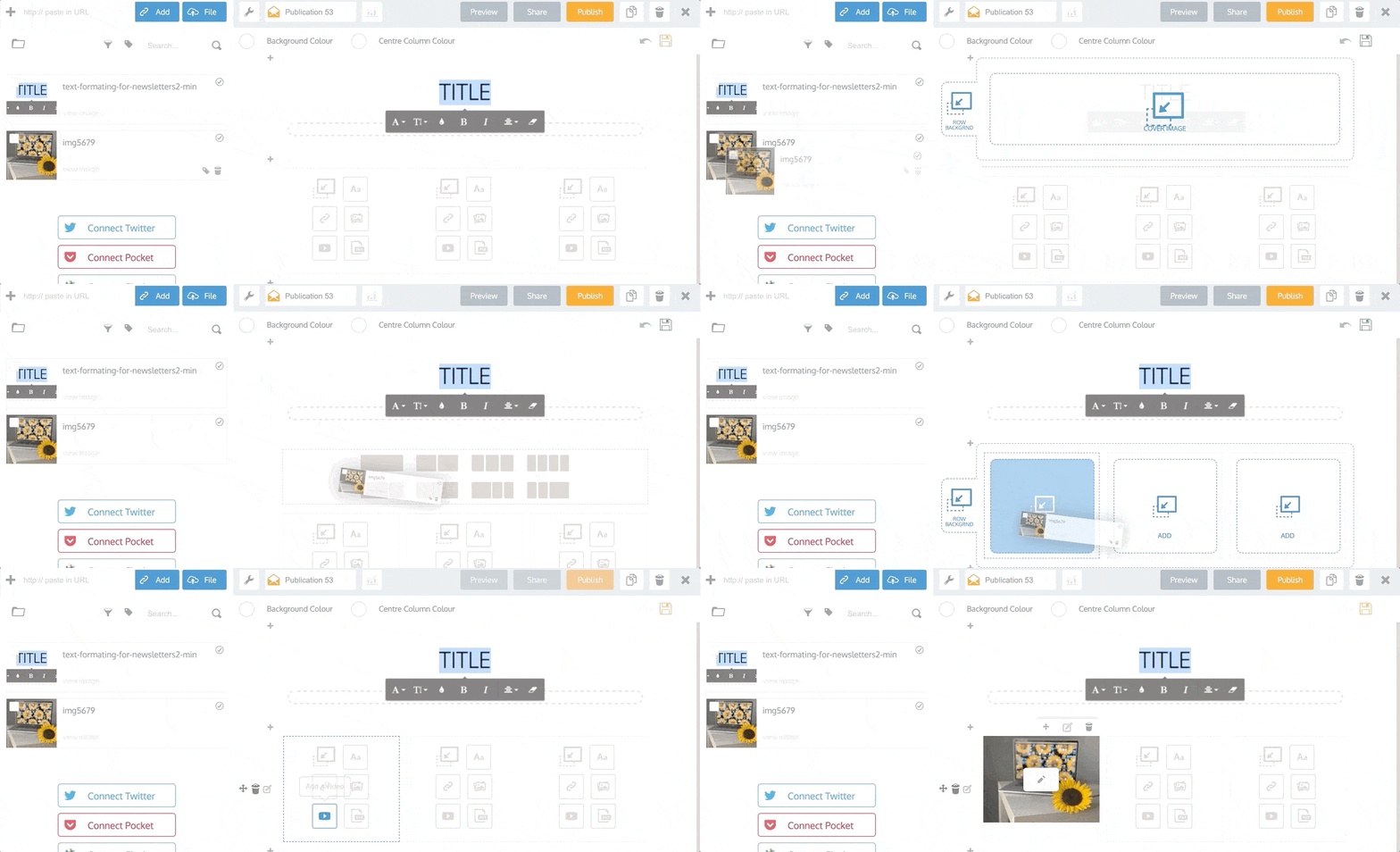
Remember, you can add any content to a Publication. Like things you find online, or even upload your own files, like .pdfs, .ppt, .xlxs etc
The more effort you put into curating and adding the best content, the more valuable your Publication will be and the better results it will achieve.
Once you have added a piece of content you can then edit it. Just click on the title or description area to edit the text.

This means you can add your own insight, commentary or opinion to all of the content you are adding. This is a very important part of good curation. Just re-sharing good content is useful, but good content with your own insight or view point added to it is much more valuable.
People like images. People click on images. We are visual creatures. Once you add a piece of content to your Publication you can make sure it is showing the right image, by selecting from any of the images we scrapped from the URL, or scroll to the end to upload your own image.
Now you can be sure that the right feature image is showcasing each piece of content, increasing the number of clicks and happy visitors!
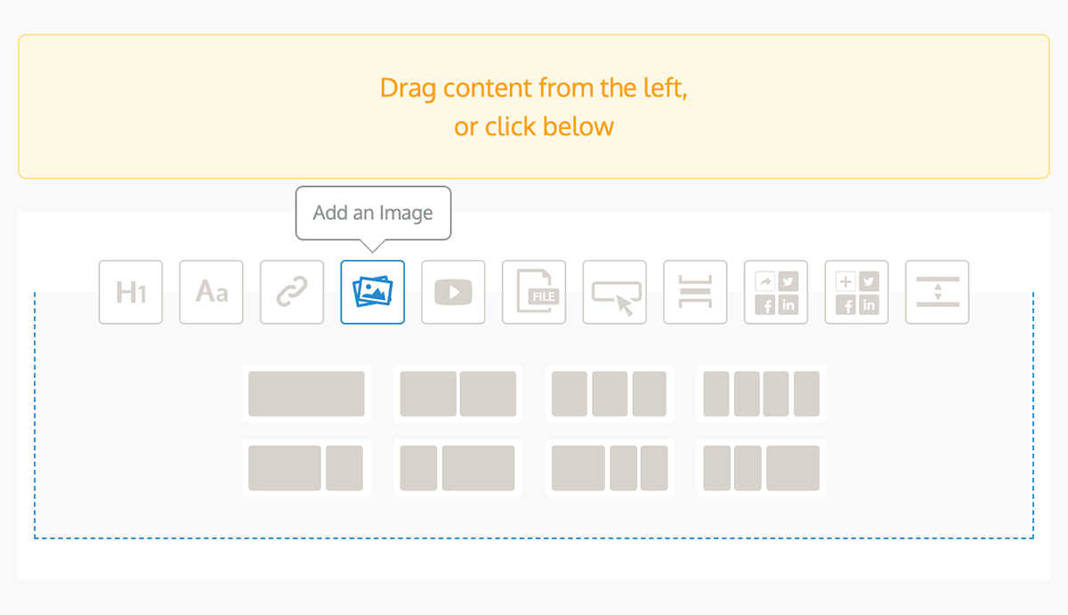
Sometimes 5 pieces of content just isn’t enough, and we want to add lots more into our Publications while we are curating. If this is you, then all you need to do is hit the add new row button and select from the available options;
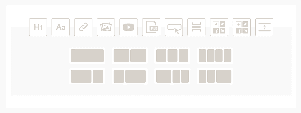
You can also add other elements to your Publication to customize the formatting, like;
Once you are happy with the content and layout of your Publication, the final touch is to put your personal stamp on it, like your or a customer’s logo. You can do this easily with the “Add image or branding” section in the header and footer of the Publication.
Just click on the area you want to add a logo or image too, then select the file you want to upload, and adjust it to just right with the other controls like, scale and left, centre and right align.

You can also add a hyperlink to it, so that when a customer clicks on it, they are directed back to your website, or anywhere else for that matter.
Now that we’ve got the basics covered, here’s a look at the extras that you might not have known about that can really help you get the most out of creating a Publication…
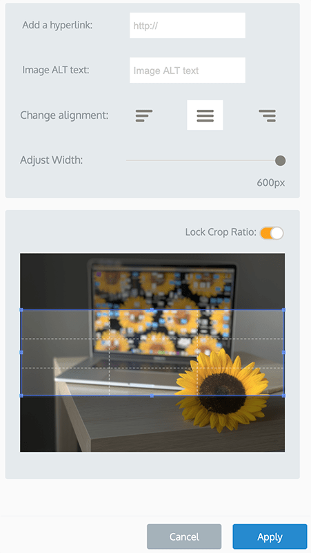
We know how important images are when it comes to getting customers attention, so making sure the image you are using looks right is just as important. That’s why you can easily position and resize any of the feature images on your content with the crop feature.
Just hold your mouse over the image you would like to crop or size and click on the crop option.

From here, just select the area you would like to show as the feature image, and you will get a live preview on the content in the Publication as you move things around.
Also note that if you want to feature an image that is not the usual feature image size, then select the Free Ratio On, and you can select any shape you like.
We know that some images need to be portrait. Just click on the down arrow over any image and it will hide the title and description of that content and make the feature image that up the whole area. Click it again and the Title and Description will appear again.
This is perfect for the times you want to have a feature image on the left and a big block of text on the right, or if you just want to put more focus on your images.
Adding blocks of text to your Publication is easy.
Just hold your mouse over an empty content block in the Publication editor, and you will see two arrows show, on the left and the right. Click on an arrow and you will see that the content block turns into a text block!
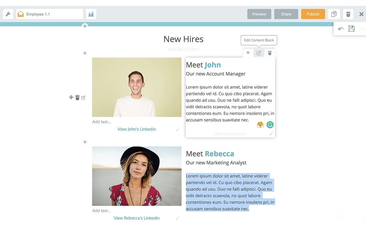
Don’t skimp here – Remember, a great curated Publication provides unique insight and commentary on the content you are sharing.
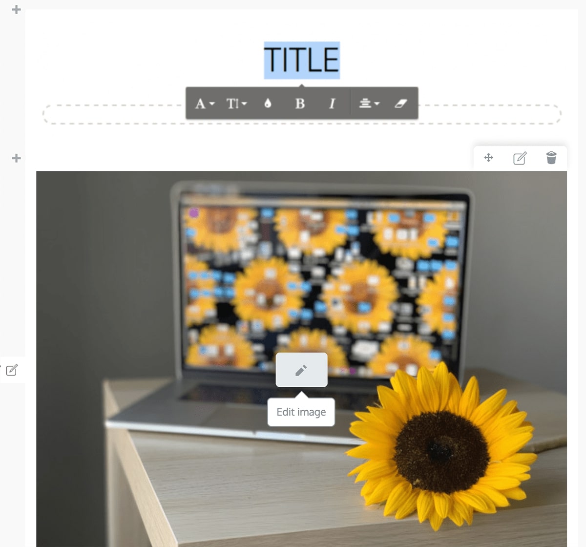
If you are wanting to add styling to text you added, all you need to do is highlight the text you wish to apply style to, and a range of options will show up. You can Bold, Italic, center align and hyperlink any of the text!

More styling and formatting options are coming soon. Let us know what you would like to see in the comments below.
Sometimes you add things and realize that this content would be better over there, or that content would be better over here, and oh I need to add that too!
Good thing everything within the Publication editor can be dragged and dropped to reorder.
Just click and hold the content you want to move, drag it to where you want to move it to. You can move content to either an empty block or a piece of content you want to swap it with, then let it go and all will be rearranged.
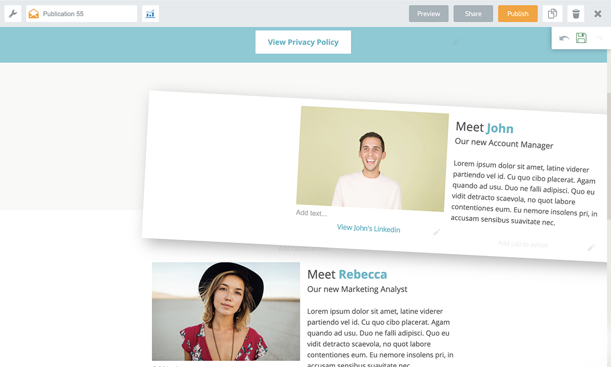
This is extra handy with the ability to add any combination of rows, as it doesn’t matter how you start off, because you can always getting it in the order and format you want by the end.
Creating content assets the way you want them in Publicate is easy;
Curating content and using it to make Publications is a simple and effective way of creating more valuable content assets like roundup blog posts, newsletters, resource hubs and branded social shares. Add them into your marketing mix, and share freely with your audiences to drive more traffic and leads.
And the best thing about doing it with Publicate: It takes just minutes!