It’s ultimately the message that matters most, but in a digital world, email design best practices can make or break how your message is received. That’s why we’re going to share email design inspiration and email design templates that can be of service to save you time and boost engagement.
We’ll also touch on the best email design software, like Publicate’s email builder.

Email design refers to the aesthetics, graphics, and elements of your email newsletter. Email design entails strategic decisions that help ensure your business’ target audience engages with your email communication based on how it looks and reads.
While it’s possible to build beautifully designed HTML emails from scratch, it’s definitely not the most efficient path to take.
Instead, you can use an email builder like Publiciate. It’s fully equipped drag and drop newsletter creator with hundreds of newsletter templates to maximise your email engagement. Choose from for any message, such as: event promotion, new employee highlights, internal communications, sales emails, holiday messages, and more.
Publicate’s templates are built with email design best practices already implemented so you can spend more time focused on the email’s content, rather than its setup.
Email design truly matters because it affects who reads your emails and engages with its content. Email communications that are well-designed are more likely to:
One of the most important elements in an email newsletter is a call-to-action, which directs the intended next step for a recipient to take. With email design best practices, you can promote engagement and prompt your audience to take action and interact.
Email design also includes your branding, so that it can be recognizable and a reflection of what your brand stands for.
From showcasing the color palette to incorporating your logo to using your fonts, you can enhance your brand’s reputation through your email communications.
With an email builder like Publicate, you can even save your brand kit, making it easy to incorporate your business’ branding in every email.
Consistent and relevant email communications with beautiful design helps to improve customer relationships, which in turn, results in increased brand loyalty. Ultimately, this can lead to better sales.
Globally, there are over 4.26 billion email users worldwide, so great email design is sure to stand out and required to grab attention. But, what exactly makes an email design so good?
The most impactful email communications possess the three C’s, namely: Clear, Captivating, and Creative. The purpose of the email is direct and immediately understood; the design draws the reader in; and the email stands out from the crowded inbox.
When reviewing email design examples, you’ll start to notice that the best email designs follow many recurring best practices.
These are some of the most prominent email design best practices to implement:
Email communications serve a purpose, and the best emails are strategically sent to drive business goals. But, rather than stopping at being read, each email should have an intended action for a next step.
This is called the “call-to-action” and when it comes to email design, it should be clear, stand out from the text, and be easy to understand where it leads. The best call-to-action buttons have copy that is short and to-the-point.
No one wants to open a long email with just text when they are already sifting through a full inbox. That’s why email design is so important, and one of the most valuable tips is to balance copy with visuals. Compelling multimedia and visuals can go a long way.
Not only do they help to break up the text, but they also help a reader scan an email to understand the content better. With an email builder like Publicate, you can take advantage of the multimedia library and directly incorporate GIFs, videos, images, file and more into your emails.
When you do include imagery, it’s necessary to add what’s called alt text to your images. Alt text is used for email accessibility, so when the images are turned off or do not load, they can still read what the image would display. Descriptive alternative text allows readers to visualize the email’s visuals without having to see or load them.
The majority of emails are read on mobile devices, so it’s absolutely imperative for emails to show up with their intended design across screen sizes. This is known as responsiveness.
Rather than having to test your email across every device size or email provider, you can rely on a tool like Publicate to take care of this point for you. Publicate tests its templates across an array of screen sizes and email providers to ensure that the email shows up properly.
What’s your email content about? An email’s subject line is the first thing a recipient will see in their inbox, so it should captivate their attention. At the same time, it should give an inkling as to what content they can expect once they open the email.
The old adage of “less is more” stands true when it comes to email design best practices. Rather than overwhelming the reader and inputting everything in one email, focus your content around the action that you want your audience to take or the information you want them to gain.
In order to keep it simple, you’ll want to be intentional about how you line up your content. Since a lot of readers scan emails, it’s best to put the most important information at the top, and then the bottom of the email.
Along with the subject line (and preview text), your audience will see the sender name in their inbox. This reflects who the email is coming from. So, depending on what you are sending, you may want to edit the email subject line accordingly.
For example, if you’re writing HR-related internal email communications for employees, it may be best to come from an HR professional directly or the HR department. However, if you’re sending marketing emails to clients from a company, then you’ll want to use the company’s name.
Rather than having to guess if your email design best practices are hitting the mark or not, you can use email analytics to show you the data. A newsletter builder like Publicate delivers email analytics straight to you as soon as you send out your email campaigns so you can review click-through rates, open rates, and a heat map.
Your footer appears at the bottom of your email message, and although it is often an afterthought, it actually is part of your email design. It should also be branded and contain useful information that may have no fit into your email message’s body. Here are some email footer best practices to know.
Now, let’s look at email design best practices in action!

This event invite template is full of email design treats. It is simple, has font and color that grabs attention, but it is still easy to read, and balances light copy with fun visuals that actually play on the copy (dog image with the street name). Plus, the call-to-action is clear.

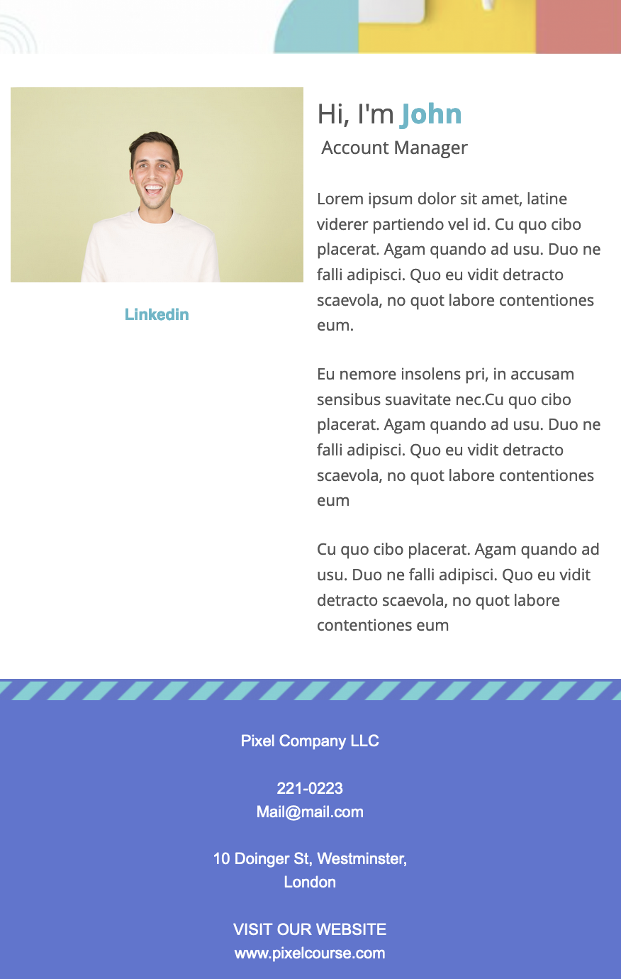
We love this new employee announcement template because it contains a lot of useful information about the newcomer, but it doesn’t feel overwhelming. Using images and right aligned font makes it easy for the eye to navigate, with adequate white space to not feel like too much.

This sales email immediately grabs attention with a full-width header and call-to-action buttons throughout which prompt the reader to shop the sale! It is clear, creative, and captivating.
To help you enact these email design best practices, there are email design tools dedicated to the cause. Check out these options:
Publicate is an email builder that makes it easy for anyone (even without a coder or designer) to create and send beautiful and engaging emails.
Publicate features drag-and-drop functionality, integrates with your favorite email service provider like Gmail and Outlook so that you can send HTML emails simply. It also provides detailed analytics at your fingertips so you can easily review and optimize your campaign’s performance.
Plus, it comes with an email template ready-to-go for any purpose, so you can design emails in no time.
MailChimp is an email builder complete with hundreds of templates to choose from and the option for anyone who knows how to code to design templates from scratch.
With no HTML knowledge needed, Stripo is another design tool that can sync up with your favorite email service provider.
For teams that wish to collaborate on email designs, Chamaileon offers that option with responsive templates as a starting point.
HubSpot offers email marketing software that helps optimize email campaigns with A/B testing and an AI-generated function to enhance your productivity.
Email design best practices go hand-in-hand with email engagement and email success. Email design should work with the copy to grab attention, support the call-to-action, and help you maintain consistent communication with your audience.
With email builders like Publicate, email design best practices are all already taken care of for you so that you can focus your time on the content and message itself. You get to save time and energy to create highly engaging branded email designs that pack a punch.
Try Publicate out for yourself with a 14-day free trial!