Valentine's Day, like all holidays, is a competitive time for marketers & business owners.
With offers, promotions and deals aplenty. Getting your audience's attention & keeping it is a challenge.
Don't give up as help is on hand! This round up of 14 Valentines newsletter ideas will help you to stand out from the crowd.
So what better place to start than with the first thing your audience sees...
According to James Uleman, a psychology professor at New You University;
"You don't get a second chance to make a first impression,"
This is exactly why your email marketing subject line is so important.
A study by Optinonster found that "47% of email recipients open an email based on the subject line alone? At the same time, 69% of email recipients report email as spam based on the subject line."
It's so important you pay attention to your email subject line as all your hard work could go down the drain!
Below are a few recommendations & tips to help you overcome this hurdle!
You need to remember that space is a premium, and none more so than in your Subject Line.
Mike Madden of Marketo, found that emails with 7 words in the subject line had the highest open rates.
If you have time, analyse your subscribers open rates against your past emails, device & ESP. This allows you to optimize your subject line length tailored to your subscribers.
Terrible email subject lines can mean a user deletes or marks the email as spam. Did you know 1 in 6 emails get sent to spam or blocked from your subscribers inbox?
To make sure you don't become that one this Valentine's, make sure you:
Tip: Create a variety of subject lines you wish to test
It is after all the season of love, and what better way to share that feeling than through an emoji.
Emojis are a great way to grab the attention of your subscriber and stick out in their inbox.
Choose your emoji with care, and avoid overuse of these in your subject line. Overuse of a emoji may make your subscriber think the email is:
This brings me to my final point...
With a well planned Valentine's Day campaign you should factor in time to A/B test your subject lines.
If you use an email service provider such as mailchimp or HubSpot, you will be able to set up and create A/B tests with them.
When running an A/B test you will want to only test one element. So if it is the subject line, then that should be the only element that differs in the emails you are testing.
Tip: Create a variety of subject lines you wish to test
You can set up your A/B Test so the platform can determine the winner as it is running. This means if email A has higher open rates then they will send this email to more of your contacts.
Or you can run the test for a period of time and then select the winner and send to remaining or new subscribers.
This is only a brief overview of how you can test your subject lines. I would recommend reading through this A/B Testing Subject Lines blog post, before you start.
Now that you have gotten your subscriber to open your email, how will you keep their attention?
Like Christmas, your subscribers will have certain expectations you need to meet.
For instance, they will know that when Valentine's Day is imminent they will expect to see hearts & bows. The colours red and pink and everything in-between will be across advertising boards.
But the most important one, will be the flood of offers and promotions to hit their inbox.
To avoid losing out to your competitors you need to make sure you have clear offers and promotions in place.
Below are a few ideas to help you entice your subscribers...
If free delivery is only given to customers who spend a certain amount, why not remove this barrier?
Valentine's Day, unlike the Christmas period, is far shorter. Offering free delivery to subscribers within a certain time frame is a perfect win.
Our florists newsletter template below uses a coupon code in the copy to highlight the offer.

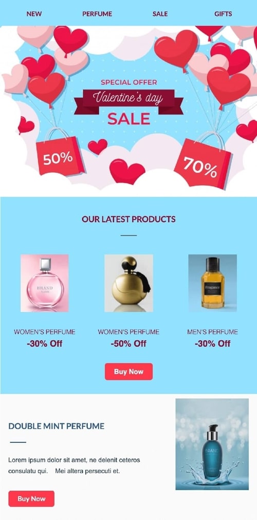
Discounts are always a winner and expected by your subscribers. In our sales newsletter template below we have been able to highlight a variety of discounts.
By showing there are more than one tier of discount on offer gives your subscribers more choice.
Why not reward the gift buyer with a little extra. Offering a free gift that is relevant to what they are purchasing is a great way to make their buy extra special.
The free gift could be gift wrapping, a small box of chocolates or a valentine's card.
Having a great offer to shout about is one thing, but there are some things that are better left unsaid...
Every holiday has a recognisable colour palette. When we see the colours orange and black we see Halloween. Red, white and blue - well it must be 4th July.
Valentine's day is no different. The key colours you will need for your base are pink and red.
The Valentine's colour palette is ideal for all brands as you can select different tones and hues.
Some popular colour palettes for Valentine's are:
This palette of passionate red and romantic pastel shades of candy pink and peach.

This palette has juicy shades of Magenta, pink and dark red,and with contrasting green & icy blue.

This colour palette is ideal if you want a more neutral palette but with bright warm accent colours.

You can find more Valentine’s palettes from colorpalettes.net.
Now that you have a colour palette to work with, you need to decide how to apply it to your newsletter template. You could look at doing the following:
Like Christmas, Valentine's Day has its own distinct visual identity. These identities are as universal as the 'x' for a kiss we all use at the end of a text or in a card.
The key symbols and icons that you could look to include within your Valentines emails are;
Using any of the symbols will highlight that this email is a Valentines promotion to your reader.
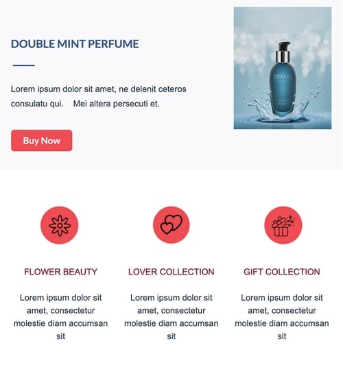
Our newsletter template below contains two variations on how to use these symbols. We have the header image which contains hearts. The footer contains heart, flower & gift box icons.
A point of caution, avoid windows 98 and clipart style graphics, or over use of graphics, less I generally more, as you will see in this template example.
You might me wondering, what if we want to do something a bit more subtle or different? Well, this is where typography can help.
When selecting a font for use most of us make our decision based on the following areas:
There are some other areas of typography which are often overlooked. Did you know there are a set of fonts which are for decorative use?
These fonts are Script fonts. You will be familiar with these fonts as they feature exaggerated swashes or serifs.
These fonts are a great way to add a more style and depth to your newsletter design.
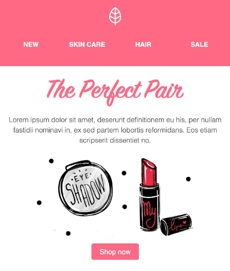
Our beauty retail newsletter combines the sans serif copy with a script font.
A point to note on fonts, make sure that any font you use is compatible with all major email service providers. All fonts in Publicate have passed tests on 57 different email clients.
Now we have covered some of the structural elements of your newsletter, it’s time to inspire them.
As a marketer during Valentine’s day it is your job to inspire and connect with your audience.
The next hurdle you need to overcome is the content of your newsletter. One of the most difficult areas is the copy.
There are a myriad of obstacles that could lead to a contact deleting or unsubscribing!
We have gathered some best practices and tips to help you avoid some common mistakes.
But before you unleash your inner wordsmith ask yourself the following:
Now you have a clearer idea of who your audience is and how you to position your comms. Let's get started!
Don’t start with "hi" or "hey" on it's own. Don't go straight in with a "check out our offers!" either. If you can include their name. Personalise your copy as much as you can. This is an intimate holiday and you should reflect that in your copy. Use words like I and you. This also lends an extra level of a care to your copy.
You want to avoid losing your readers attention. So, get to the point. You want your readers to be able to make decisions fast as possible so they visit your site.
If you're wordy and waffle you could lose their attention, bore them or confuse them. If that happens they will be less likely to take the action you want them to.
What are the benefits of what you're offering? How will this help them to celebrate or show their love for someone? Remember the copy should reflect the fact this offer or experience is about them not you. You want to add value to their Valentine’s day.
The preview text is a snippet of copy from the main body of your email. You will see this underneath the sender name and subject line. This copy is like a meta description in Google search results.
These couple of lines of copy are a great place to add in some extra messaging to entice them further.
If you want some more tips, this article on email copywriting has some great pointers.
Throughout the post we have looked at different ways to encourage your readers to take an action. With the result being that they go visit your site. But there is one important thing we need to nail the CTA.
Having too many call-to-actions in your newsletter will increase confusion. Contrary to what think, too much choice generally results in no choice selected.
You also need to ensure that CTA is reflective of what the subscriber will find on the landing page. For example if they "gifts for her" they should land on a page with gifts for her, not gifts for a him.
If is not relevant to the CTA, they will immediately bounce from the site.
So over emphasising the CTA to get a click is meaningless in the long run.
Although we have been encouraging you to get creative with copy and design. We recommend for your CTA's to stick to these rules:
If you use the tips from the first 7 ideas in this post you will give your Valentine's campaign a boost!
But if you want to build on this and achieve even more then keep on reading as we reach idea number 8!
The volume of offers that your subscriber will receive, could leave them numb to the holiday of love.
Why not try offering your subscribers something more than a voucher code or discount.
Why not curate a newsletter that contains articles around:
This could be a special Valentines blog roundup newsletter you send out. Or you could add an article to your promotional newsletter.
We have a variety of blog roundup newsletter templates, including the one below.
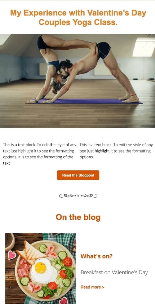
This template's flexible layout allows you to organise content depending on it's importance.
If you do not have content or are not able to create this type of content, why not curate this from around the web.
Our HTML email editor allows for simple and quick insertion of content from the web. Copy and paste the web page URL and voila it populates the templates module!
Now you have shown them how to plan their day or night, you need to provide them with the right tools for the event!
You know that saying, actions speak louder than words. Well, you've shared great content to help subscribers plan their Valentine's.
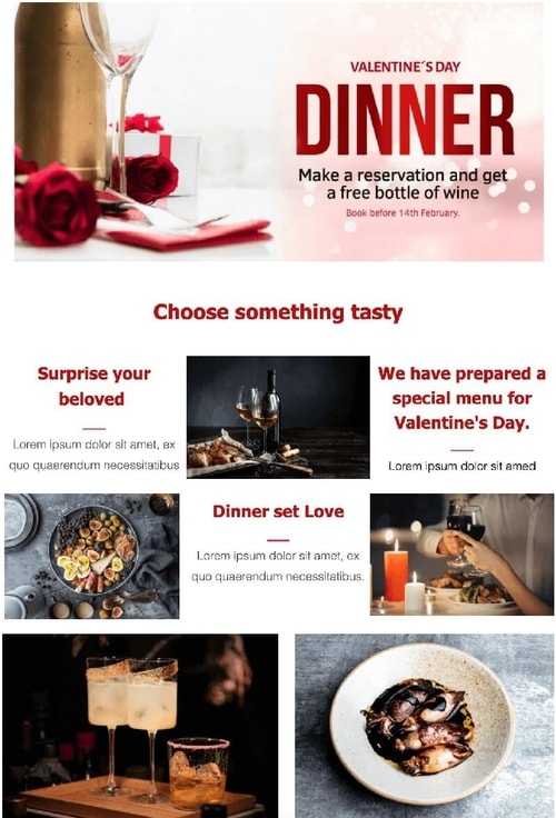
Why not create a special Valentine's package? When you think of promoting an evening in, if you are a take out service why not create a special Valentine's set menu.
Or provide a free bottle of wine (or non alcoholic equal) for every reservation made before 14th Feb.
This Valentine’s events template, header banner highlights the offer and the timeframe.
Packages aren’t only limited to food. You could pair products together that compliment one another such as:
As we look back at the ideas and examples above there are a couple of things missing...
Yes men deserve love and attention too and gifts also! It is often portrayed that it is men who do the planning and spending on Valentine's and it is women who are spoilt.
Well the world has progressed and you should not make assumptions.
In reality Valentine's day is a day for everyone.
To make sure no one misses out this Valentines, create gifts for her and for him. You don't need to send separate newsletters to each. You could create one like our Valentine’s gifting newsletter template below.
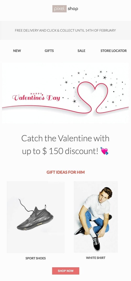
This newsletter template layout is great for showcasing products from different departments.
The neutral tones allow for a mixture of products to stand out, but not clash. The Valentine's palette and imagery used is subtle but in keeping with the day's theme.
We have highlighted in this section that you need to be careful of making assumptions. With limited data about your subscribers, how do you know they are all in a relationship, which brings us on to tip 11?
This Valentine's Day, not everyone is in a relationship or position to spend it with loved ones.
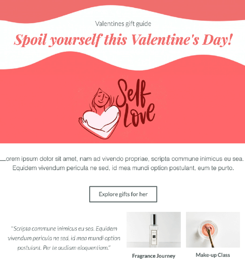
So why not encourage people to indulge in some self love and care this Valentines.
When creating a design focusing on the self, ensure you use images focused on an individual.
You can still use Valentine's based colour palettes as the colours are warm and rich. In the self love newsletter template we have also included a white background with a light grey font. This helps to portray the serene feeling of indulging in some self care.
As with any campaign time is always something you never have enough of. So for our last three ideas we want to review planning.
With every campaign the earlier you plan and launch, the better your ability will be to deliver!
You will also be able to allow for A/B testing and the creation of a more personalised marketing campaign.
If you are using platforms such as HubSpot you can look at creating workflows. These workflows are great for automating your email campaigns. They trigger events that you set up in a sequence based on what action your contact performs.
The most popular and common one is, to create triggers which fire if a user clicks on a CTA in an email or doesn’t. If the user clicks on one you can either class that as job done or send them more content based on what they engaged with. If they haven’t you can send them a gentle reminder email.
If we take this Valentine’s travel newsletter you can see that there are a variety of holidays on offer:
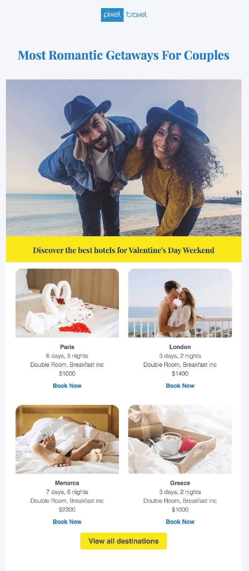
If they clicked on the trip to Greece, the trigger in the workflow, would fire. This trigger could be set to send a follow up email with more holidays.
But the key here would be to send them more trips to other Greek desitinations. For example, trips to Cyprus, Santorini and Corfu.
Using the workflow you can set the follow up to be 3 days after they clicked the link in the original email.
It's a great way to build up segmented subscriber list based on behaviour. This will mean you can deliver more personalised content in the future.
Working with workflows can mean an increase in the number of emails you need to create. So how can you do this without decreasing quality or slowing down the launch of your campaign?
There are so many considerations for you and the team to take into account. So many decisions to agree on that you need to be able to work in a more agile way.
There are several options available to you.
One is to reuse old campaign assets and adjust them for Valentines. We have done this with one of our Christmas Last Chance newsletter template.
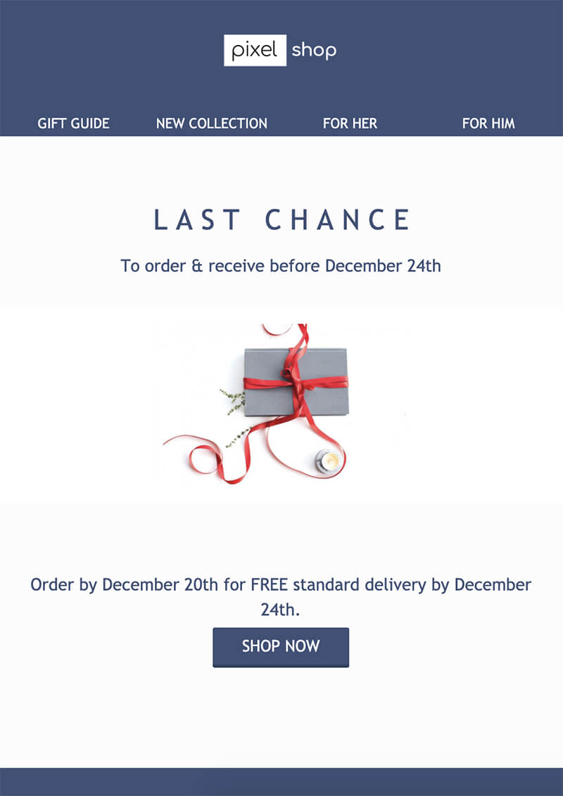
All we needed to do was customise the copy and updated the CTA Colour. We now have a Valentines Last Chance newsletter template!
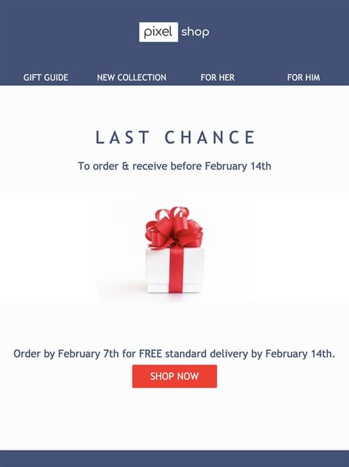
You could look at updating your colour palettes from previous Valentine’s campaigns. Which you can then apply to existing design assets like headers, graphics and images.
Or you and your team could sign up with us today. We've already done the hard work for you. Our professional Valentines newsetters are ready to go straight out of the box. All you need to do is update with your own copy and branding.
We have spoken about time in regards to your planning and delivery but what about your customers?
When launching your campaign, you will be focusing on the number of people who click through to your site.
You may assume you have reached your goal, they’re on the site they will now buy, order or book? But that is not always how it works.
As we discussed earlier your contacts inbox will be full of flashy offers and deals. You need to remember that means they have more choice and will wait for the best deal.
Or they may be a lazy shopper and leave everything to the last minute.
Which isn’t ideal for your weekly reporting to management or your stress levels!
To tackle this we would recommend creating a sense of urgency. You can do this by:
By creating a sense of urgency, you will be able to help your subscriber make a decision. It’s also a great way to remind them of your offer, as they may have forgotten about it or the event!
Now you're ready to get started on your Valentine's campaign. There are few things key things to remember:
Launch your campaign as early as you can, so you can take advantage of A/B testing.
Your Valentine's Day subject line is important, with one in 1 in 6 emails ending up as spam take care with these.
Make sure your offers and promotions are clear and in turn your call to actions are accurate.
Don't make assumptions about your reader's romantic status. Ensure you cater for all possibilities.
Make sure the visual identity of your layouts are reflective of Valentine's Day.
Think about how you can reuse existing design assets and templates to save you time.
There you have it 14 Valentine's Day Newsletter Ideas. We hope these have inspired you and we wish you and your team a successful campaign!